Sales & HR Analytics Dashboard
Project Overview
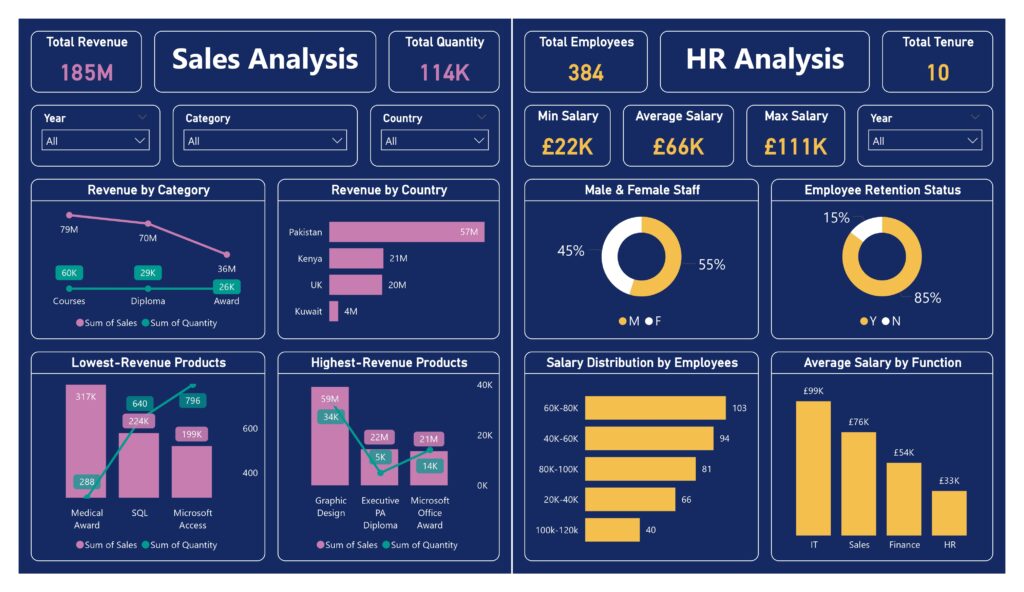
In this project, I designed and built an end-to-end interactive analytics dashboard to help a company understand its sales performance, workforce structure, and revenue drivers at a glance.
The goal was not just to visualise data but to answer real business questions that leadership teams typically ask:
-
Where is our revenue really coming from?
-
Which products and regions drive growth — and which underperform?
-
How is our workforce structured in terms of salary, retention, and gender balance?
-
Where can data guide smarter strategic decisions?
This project demonstrates my ability to translate raw data into insights that non-technical stakeholders can immediately use.
Tools & Skills
-
Power BI (data modelling, DAX, interactive dashboards)
-
Business analytics & KPI design
-
Data storytelling & visual design
-
Sales, HR, and revenue analysis
Key Insights Delivered
Sales Performance Analysis
-
Total revenue of £185M, broken down by product category, country, and year
-
Clear identification of highest-revenue products (e.g. Graphic Design & Executive PA)
-
Detection of lowest-performing products, highlighting opportunities for optimisation or discontinuation
-
Comparison of sales value vs. quantity, uncovering pricing and demand patterns
Geographic Revenue Breakdown
-
Revenue concentration analysis across UK, Pakistan, Kenya, and Kuwait
-
Immediate visibility into high-performing and underperforming markets
-
Supports decisions around market expansion and regional investment
HR & Workforce Analytics
-
Workforce overview with 384 employees
-
Gender distribution analysis (55% male / 45% female)
-
Employee retention insights, showing an 85% retention rate
-
Salary distribution and averages by function, revealing:
-
Pay disparities across departments
-
High-cost roles and potential optimisation areas
-
Why This Project Matters
This dashboard is designed exactly how decision-makers think:
-
Simple, clean visuals
-
High-level KPIs for executives
-
Drill-downs for analysts and managers
Instead of static reports, stakeholders can interactively explore the data, filter by year, country, or category, and instantly see the impact.
This project reflects how I approach data science and analytics:
Not just building models or charts — but delivering clarity, insight, and business value.
How I’d Take This Further
If this were a real business deployment, the next steps would include:
-
Forecasting future revenue using time-series models
-
Customer or product segmentation to improve targeting
-
Attrition risk modelling for HR
-
Integration with real-time or automated data pipelines