Project Overview
The dashboard was developed to help executives quickly answer high-value questions such as:
-
How are sales trending year-over-year?
-
Which product categories and cities drive the most revenue?
-
Where is growth slowing, and what might be causing it?
-
Who are our top customers, and what are they buying?
Through clean modeling, DAX calculations, and layered visuals, the report transforms raw transactional data into clear business insights.
Key Insights & Dashboard Components
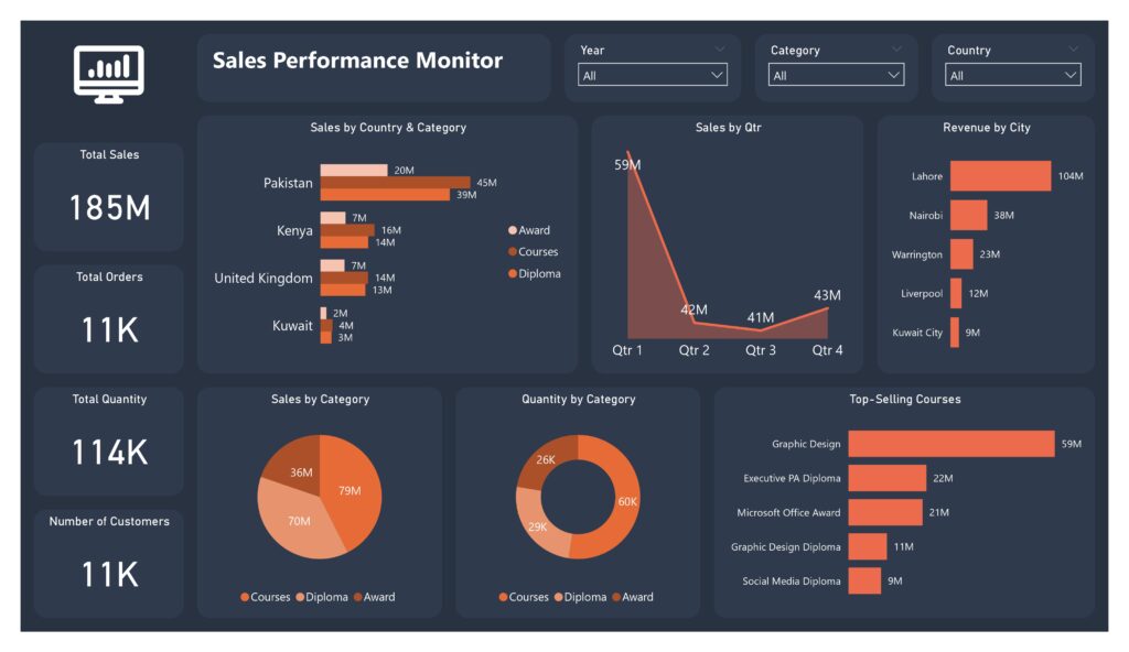
1. Executive Sales KPIs
At the top of the report, I summarised the main performance indicators:
-
Total Sales
-
Total Quantity Sold
-
Total Orders
-
Number of Customers
These KPIs give leadership an instant view of commercial performance.
2. Revenue Across Countries
A geographic breakdown highlights revenue contribution from key markets such as:
-
Pakistan
-
Kenya
-
United Kingdom
-
Kuwait
This allows the business to identify its strongest regions and uncover potential expansion opportunities.
3. Year-over-Year Sales Performance
Using a combination of DAX measures and matrix visuals, I calculated and displayed:
-
Current year sales
-
Previous year sales
-
Year-over-year growth percentage
For example, trends from 2020 to 2022 clearly show fluctuations including significant declines or growth, enabling operational teams to investigate the causes.
4. Revenue by Category
The dashboard breaks down revenue into major product groups such as:
-
Courses
-
Diplomas
-
Awards
This insight helps the company understand which offerings generate the highest returns.
5. Revenue by City
A city-level view highlights major revenue centres including:
-
Lahore
-
Nairobi
-
Warrington
-
Liverpool
-
Kuwait City
This helps in regional targeting, resource allocation, and local marketing strategies.
6. Top-Selling Courses
A ranked bar chart reveals the company’s most in-demand training programmes (e.g., Graphic Design, Microsoft Office, Social Media Diploma).
This supports product strategy and informs decisions about pricing, staffing, and marketing spend.